Nesti ⎯ Making specialist housing more human, accessible and easier to navigate
⎯ Finding the right home can shape every part of a person’s life. Nesti provides specialist accommodation and housing services designed around the individual, their choices and the way they want to live.
We created a more accessible and human digital experience that makes Nesti’s homes easier to find, explains a complex housing journey clearly and supports the organisation’s wider property services.
Services
UX Design
UI Design
Development
CLIENT
Nesti
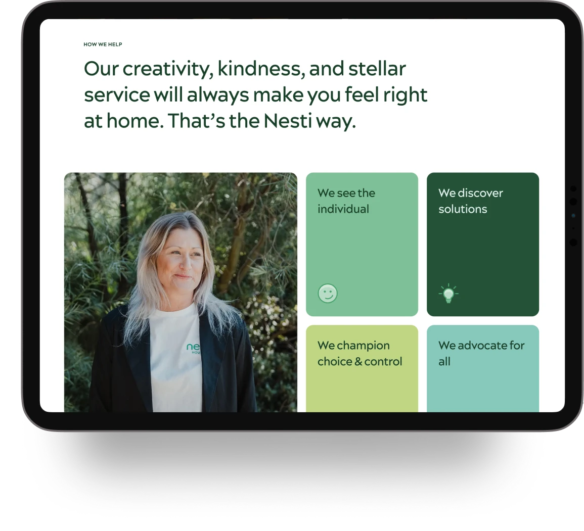
Put people before service categories
Nesti’s difference is not simply the homes and services it provides. It is the attention given to the life each person wants to create within them.
The previous website did not express that clearly. It focused heavily on service information and did not fully communicate the breadth of the organisation or the outcomes it works to achieve.
We shifted the story towards people, choice and belonging. The content speaks directly to residents, families and supporters in natural language, without talking down to them or reducing their experience to funding, eligibility or disability.
Give every audience a clear way in
Nesti serves residents, families, support providers, property owners and developers. The website needed to help each audience find the right information without fragmenting the organisation’s story.
We used the main navigation to create a clear path through the offer. Our homes helps people explore properties, vacancies, locations and SDA design types. How it works explains first steps, fees, funding and freedom of choice. What we do introduces Nesti’s property, maintenance, realty and co-design services.
Each area answers a different need, while the overall experience remains connected by Nesti’s focus on better housing outcomes.
Accessible without feeling clinical
Accessibility needed to be fundamental to the experience, not added after the design was complete.
The website was designed to meet WCAG AA requirements, with keyboard navigation, screen-reader support, contrast controls, text resizing and reduced-motion options.
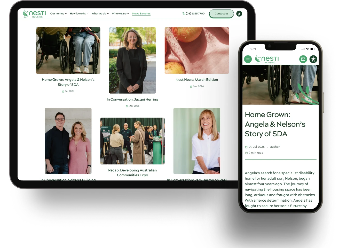
Clear space, strong hierarchy and concise copy make pages easy to scan across devices. Friendly typography and natural language keep the experience approachable.
The imagery focuses on people enjoying their homes, relationships and everyday lives. It avoids using disability as a visual shorthand and instead reflects the independence, connection and belonging Nesti works to support.
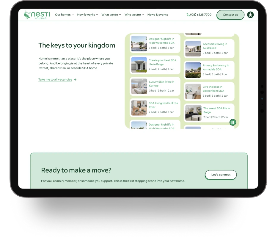
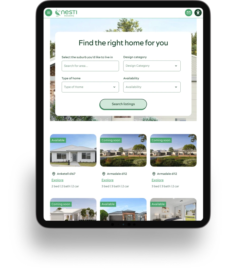
Make the right home easier to find
People often begin with a clear idea of where they want to live and what their home needs to support.
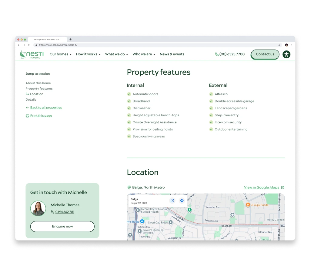
We simplified property search around the decisions that matter most. Homes are grouped by region, with focused filters and spacious, accessible controls. Clear labels and icons surface essential information on listing cards, while property pages organise features into sections that are easy to scan.
Eligibility checks and property enquiries open in a drawer over the current page. People can complete a form and continue exploring without leaving the home they were viewing.
The website automatically sends Nesti the relevant page and property details with each enquiry. This removes unnecessary work for the user and gives the team more reliable information for follow-up.
Give every audience a clear way in
Nesti serves residents, families, support providers, property owners and developers. The website needed to help each audience find the right information without fragmenting the organisation’s story.
We used the main navigation to create a clear path through the offer. Our homes helps people explore properties, vacancies, locations and SDA design types. How it works explains first steps, fees, funding and freedom of choice. What we do introduces Nesti’s property, maintenance, realty and co-design services.
Each area answers a different need, while the overall experience remains connected by Nesti’s focus on better housing outcomes.
Accessible without feeling clinical
Accessibility needed to be fundamental to the experience, not added after the design was complete.
The website was designed to meet WCAG AA requirements, with keyboard navigation, screen-reader support, contrast controls, text resizing and reduced-motion options.
Clear space, strong hierarchy and concise copy make pages easy to scan across devices. Friendly typography and natural language keep the experience approachable.
The imagery focuses on people enjoying their homes, relationships and everyday lives. It avoids using disability as a visual shorthand and instead reflects the independence, connection and belonging Nesti works to support.

Userkind is a digital design agency in Sydney founded by Lucie Bertiau & Garreth Wills.
Userkind acknowledges the Traditional Custodians of the land on which our Sydney team work, the Bidjigal, Birrabirragal and Gadigal people. We recognise their continued connection to the land and waters of this beautiful place, and acknowledge that they never ceded sovereignty. We pay our respects to their Elders past and present and extend that respect to all First Nations people.
© Userkind 2026. All rights reserved