Provision ⎯ Helping independent optometrists find the right support through a clearer, more flexible website.
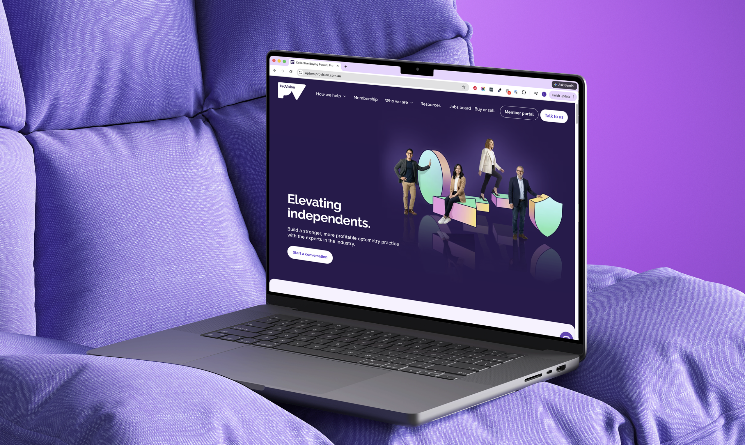
⎯ A practice finding its feet needs different support from one preparing for its next chapter. ProVision understands both, and everything in between. But its website made that breadth difficult to understand.
We created a clearer way to explore support, by stage of practice or by service, on a flexible platform ProVision’s team can manage.
Services
UX Design
UI Design
Development
CLIENT
Provision
A valuable offer, hard to navigate
ProVision offered support across practice ownership. Its website made people work too hard to find the part that mattered to them.
The existing site held a broad range of services, but cluttered content, weak hierarchy and difficult navigation made the offer hard to understand. A prospective member could not easily see which support was relevant to their situation, while existing members had to work through the same complexity to find services they could use.
Slow performance, particularly on mobile, added friction. The platform also limited the marketing team: creating pages or supporting new campaigns regularly required design and development help. ProVision needed a site that made its value clearer to customers and was easier to operate internally.
Organising a complex offer around real needs
Optometrists needed to understand how ProVision could help before they compared services or membership tiers.
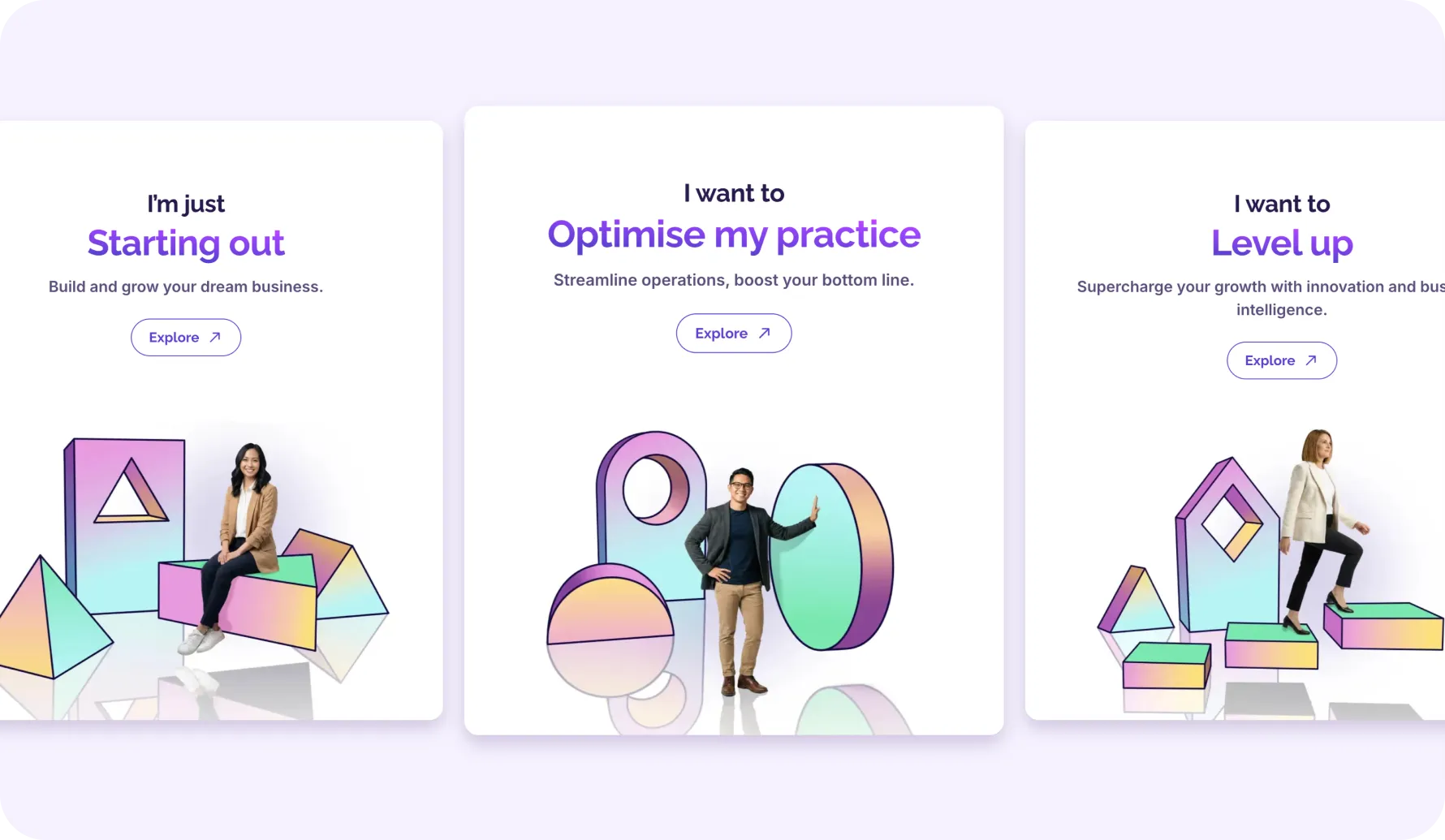
We gave visitors two ways to explore the offer: by where they were in the life of their practice, or by the type of support they needed.
Someone starting out may not know which services to look for. An experienced practice owner may arrive with a specific challenge in mind. Both can now find relevant support without first having to understand how ProVision organises its business.
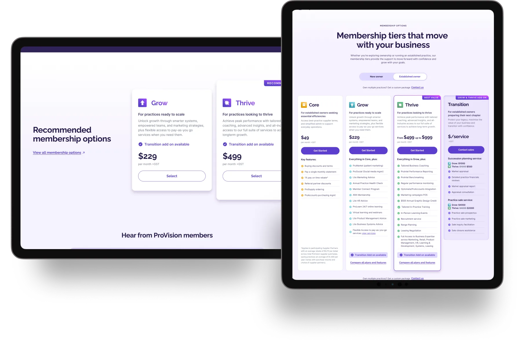
Membership options are introduced once that value is clear. Rather than presenting Core, Grow and Thrive as another set of services to decipher, the site explains them as different levels of access to ProVision’s support.
Making clarity easier to maintain
The site needed to feel simpler for customers without becoming restrictive for the team managing it.
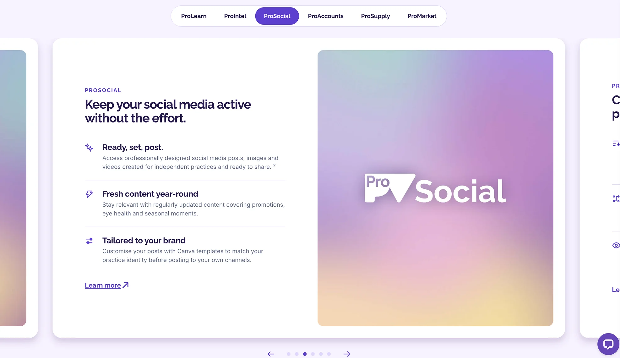
We turned ProVision’s extensive content into focused pages with clearer messages, less density and a deliberate path into further detail. Each page explains what a service can do for a practice before asking visitors to navigate its features or membership requirements.
That structure is supported by a modular design system and customised Payload CMS. ProVision’s marketing team can create pages and campaigns independently, while reusable components protect the quality and consistency of the experience.
The team began using the CMS during development, allowing us to refine it around their real publishing needs. The headless platform also gives ProVision a flexible foundation for future services, including gated member content.
The impact
A clearer site, easier to run.
The early value is visible in the experience and in the way ProVision’s team can now manage it.
The new website delivers a faster, more reliable experience. ProVision’s marketing team can publish pages, update content and support new initiatives without routine design or development assistance.
Longer-term acquisition and engagement results are still being measured following the April 2026 launch. We will add verified figures when they are available.

Userkind is a digital design agency in Sydney founded by Lucie Bertiau & Garreth Wills.
Userkind acknowledges the Traditional Custodians of the land on which our Sydney team work, the Bidjigal, Birrabirragal and Gadigal people. We recognise their continued connection to the land and waters of this beautiful place, and acknowledge that they never ceded sovereignty. We pay our respects to their Elders past and present and extend that respect to all First Nations people.
© Userkind 2026. All rights reserved